
11 colors x 11 colors = Joy! (Larger)
Richard Schmid said it best, when writing about his experience with doing these charts when he was an art student:
“When I finished I knew more about my paint than I had ever thought possible. It was an astonishing experience—imagine being taken into the kitchen of a great chef and shown everything he could do with flavors—that was what it was like for me! There was nothing tedious or boring about doing the charts; each was a revelation of the power that awaited me…”
I’ve been working on these charts for about two weeks and it has been an amazing experience, just as Schmid described. I’ve had moments of sheer delight at the unexpected appearance of a beautiful coppery color or a lovely mulberry. I was flown back in time to memories of dipping easter eggs in dye and seeing the colors emerge, and could almost smell the scent of the redwood forest with the appearance of sharp dark greens and rich deep reds.
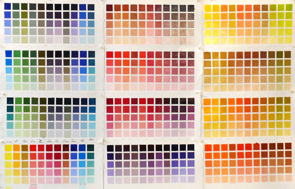
The purpose of doing the charts is to see, understand, and remember how they behave. They also provide a wonderful resource to refer to again and again. I mixed 11 colors with each other and then lightened them in 5 steps, so that the first row is pure color and the last row is a tinted white. Adding more colors, more steps…the possibilities are endless! These could also be done with watercolor, using water instead of white paint.
(Please click “Continue Reading” for more…).
Before I did these charts I did a number of others to narrow down the paints I’d use in my “final” palette. I’d been using mostly Gamblin paints but have switched to Winsor Newton. After doing tests comparing the intensity, brightness and consistency I strongly preferred the WNs.
The basic palette I settled on is Cadmimum Lemon, Cadmium Yellow, Yellow Ochre Pale, Cadmium Orange, Winsor Red, Alizarin Permanent, Burnt Sienna, Winsor Violet, French Ultramarine, Manganese Hue, Viridian.
The four charts in the first thumbnail below are Cad Lemon, Cad Yellow, Yellow Ochre Pale and Cad Orange. The 2nd thumbnail has Burnt Sienna, Winsor Red, Alizarin Permanent, and Winsor Violet. The last set of charts is Ultramarine, Manganese and Viridian and one chart with all of those colors unmixed. It also has some Cadmium Reds and is labeled as such. Click each thumbnail for a close-up view.


To paint the squares I used a small palette knife on a Fredrix 12×16″ canvas pad (actual primed canvas sheets in a pad) that I taped with 1/4″ artist tape into one inch squares. A palette knife makes the process much quicker because you can quickly wipe the paint off the knife without having to clean a brush before moving on to the next color.
To help me easily get the order right, I made a little spreadsheet in Excel. If you click to enlarge the image, you’ll see that each row in the spreadsheet matches a top row in one of the charts. On each row, the left column is the primary color for the chart that is mixed with each of the colors moving across to the right.

The detailed instructions I followed are in Richard Schmid’s book Alla Prima: Everything I know About Painting (expensive, but a worthwhile investment). Here’s a brief paraphrased excerpt:
- Top row across each chart is pigment as it comes from the tube. The vertical columns are those same pigments or mixtures with white added in increasing amoutns, like a little value scale for each color.
- Bottom row should be just off white, as light as possible while still being an identifiable color.
- Middle row should be the value halfway between top and bottom rows and will vary depending on how darkor light the color is.
- Second and fourth rows should be halfway between the rows above/below them.
- First chart is each pigment straight from the tube and then lightened down to make 5 values. The second chart is Cadmium Lemon mixed with each palette color (top row) with the Cad Lemon predominating, then lightened with white down to five values. Continue with a new chart for each of the palette colors.
This has been a tremendous learning experience and a very enjoyable process. I highly recommend it.

14 replies on “Infinite Color & Joy: Charting My Palette”
Thanks for sharing…Hmm well now i know why our profs made us do these in art 220 …the purpose was completely lost on us as sophomores in college…we traded colors so we could get them done…a HUGE undertaking when you have a full college load and art classes were twice as long and twice as demanding as the regular classes for the same credit…add in three sketches a day and two hours of homework…we didnt have time to think did we?! maybe i should do this again…now that i can appreciate it…
LikeLike
You’ve done a magnificent thing here! Of course, I am a color-chart obsessive, so I’m inclined in this direction.
Bruce Macevoy at http://www.handprint.com gives instructions for making PAINT WHEELS (http://www.handprint.com/HP/WCL/tech15.html) which are absolutely magnificent. Once you learn to read them, they are wonderful references, too.
I don’t know whether you can do them in oils… don’t really see why not. Does not approach the tints, just the straight-from-the-tube mixes.
Brava!
Gwendolyn
LikeLike
As Gwendolyn’s painting instructor, I’m bemused by her note, since I have certainly had oil painters doing said charts in class. They are without a doubt extremely important, and, Jana, yours are awesome.
I think three-way charts are the most important. In fact, I have old homework assignments to that goal, which I think I’ll mail to Gwendolyn!
LikeLike
these are great reference, and pretty great to look at. I should do something like this, I need to understand colours a bit better. The thing with the flavours is a good analogy and it makes me want to go to the kitchen and play with the cilantro/coriander. thanks for posting!
LikeLike
These are a beautiful work of art just as they are! 🙂
LikeLike
This is a really great post Jana – I’ll be sending you visitors come Sunday! 😉
I know you’re in oil painting mode right now – but you might like the last couple of posts on my blog – both about watercolour – an exhibition and a competition……..
LikeLike
One question, I have not noticed a notation of what white you’re using? This one factor makes such a big difference it’s amazing.
Great job on these though, it’s a lot of work for sure.
LikeLike
Jana, thanks for this! Wonderful job and something I really need to do!
LikeLike
Great work Jana. I too, have started this process. I must admit that I have not gotten this far. I am using only the limited palette that Macpherson suggests – I’ll never have these beautiful color charts such as you have. Beautiful!
LikeLike
WOW – mind boggling! and yet facinating.
LikeLike
If I ever try oils someday I will have to remember this and do charts to grasp them better.
Thanks for sharing Jana.
LikeLike
Jana,
This is a great post, wonderful and I just stumbled into it today. I have a web site on a product (endorsed by Richard Schmid too) that saves the time of taping out the charts and allows a painter to get right on with the painting part.
It is colorfrontier.com.
Thanks, Randal
LikeLike
[…] you like to paint, check out this artist charting her color palette. Looks like quite the project, but perhaps a worthy one. If you decide to do this, let us know how […]
LikeLike
hello, I have your book “all I now about painting”, but I have a question: you don’t have the color chart for sale, I have all your DVD and book. But I like infinitely have the color chart with all the combination.
LikeLike